How Can On-Call Monitoring Spot Anomalies at a Glance Across 200 K8s Pods?
An Incident Response After Release
At 10:40 a.m. on release day, a business contact posts a message in the group chat: "Users are reporting slow responses. Can you check whether the backend is having problems?"
On-call engineer Xiao Zhou opens the monitoring page and sees the status of 200 Pods.
He only wants to do one thing: see which ones are unhealthy.
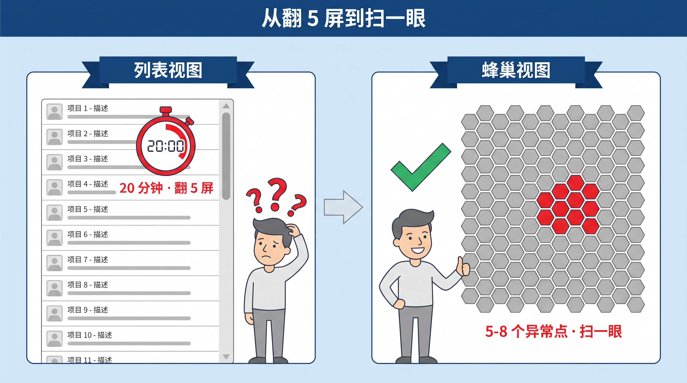
But those 200 rows of Pod status require scrolling through three, four, then five screens. What he is doing is no longer troubleshooting. It is "scrolling to find anomalies."
People in the group chat start asking, "Which service is slow?" Xiao Zhou returns to the monitoring page and continues scrolling to the sixth screen.

By the time he reaches the sixth screen, Xiao Zhou realizes that the problem is not "the list is bad." The problem is that the list is being used in the wrong place: a density scenario.
The Root Cause: List Views Are Designed for Precise Queries, Not Dense Scanning
On-call work here can be split into two actions:
- Dense scanning: find which Pods are unhealthy among 200 objects
- Precise query: inspect status, image, IP, and node for one specific Pod
The list view is a tool for the second action. When there are five Pods, it works well: every row is equal, readable, and precise, and you can click whichever one you need.
But once a K8s cluster reaches 200 Pods, the "at a glance" action on-call engineers want becomes row-by-row visual search. That is a different action, and it is not what lists are good at.
The deeper problem is anomaly distribution. In real production environments, Pod anomalies are often not evenly distributed. They may concentrate under one Deployment, on one scheduled Node, or inside one Namespace.
The list view flattens all of that distribution information. Every row looks equal, and anomalies have no visual "rise." By the fifth screen, the on-call engineer's brain is really doing color memory, scrolling, and backtracking. That memory load becomes especially heavy when the business side is asking for an answer.
Human vision recognizes density differences much faster than individual row states. That is the visual foundation that makes the honeycomb view useful in engineering practice.
Breakpoint One: Anomalies Do Not Stand Out, So On-Call Engineers Rely on Memory
Xiao Zhou's judgment at the time is that anomalies must be clustered somewhere, but the list flattens that clustering.
What he needs is not "make the list prettier." He needs "a different way to look" that puts anomalies on one screen as density.
That is the role the honeycomb view later takes in the on-call workflow.
The honeycomb view is designed to provide density presentation for high-density objects: all 200 Pods are arranged on one screen, abnormal Pods are marked with one visual signal such as color, shape, or brightness, and normal Pods use another visual signal. Anomalies naturally rise into visual focus.
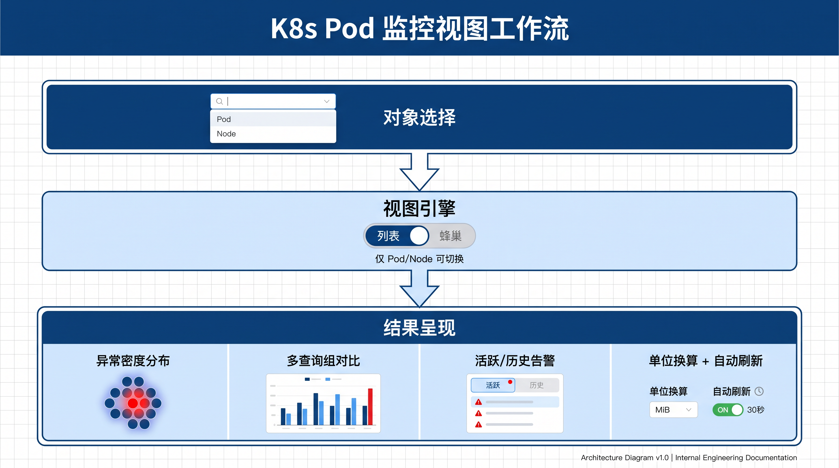
But this capability is not universal across the whole platform. It has a limited scope. Only Pod and Node objects support switching between list view and honeycomb view. Other objects, such as databases, middleware, and network devices, use list view.
That "only" is not an omission in engineering. It is an intentional capability boundary: other objects usually number around 5-20 in production, where lists are already enough and honeycomb would become over-abstraction. Honeycomb is only opened for truly high-density objects that typically appear in groups: Pods and Nodes.
Breakpoint Two: Honeycomb "Anomaly" and Alert Center "Alert" Are Not the Same Thing
After switching to honeycomb view, Xiao Zhou quickly discovers that the "anomaly" shown in honeycomb and the "alert" shown in Alert Center are not the same thing.
He checks the metrics from that moment. Several Pods look abnormal in honeycomb because their metrics are near the threshold, but there is no corresponding active alert in Alert Center because the threshold rule has not triggered yet. Conversely, the group chat mentions that one business has already alerted, but the honeycomb metrics have not yet refreshed to that alert moment.
The two states come from different semantics:
- Honeycomb "anomaly" is based on instance metrics reported by collectors, such as CPU, memory, network, or readiness probes. It is a real-time metric state
- Alert Center "alert" is an alert event triggered by threshold rules or no-data rules
These two states can be out of sync. On-call engineers use honeycomb to scan for metric anomalies and Alert Center to filter by alert status. The two views complement each other, and neither should be used alone.
Breakpoint Three: View Switching Is Bidirectional, Not a One-Way Replacement
At first, Xiao Zhou thinks honeycomb is a replacement for lists. Later, he realizes the switch is bidirectional.
In on-call scenarios, the two views are complementary:
- At the start of a shift, when the goal is to quickly see which areas are unhealthy, honeycomb provides information through density differences
- When Pod count is greater than 50 and anomalies are clustered inside one group, honeycomb has enough density signal to matter
- After one abnormal Pod has been located and the engineer needs status, image, IP, and node, list view provides precise information in table form
- For precise multi-condition filtering, monthly audits, or capacity inventory, list view supports the workflow of checking objects one by one
Switching is instant. Scan the honeycomb, find an abnormal cluster, open that area, see the list, and locate the specific Pod.
Reconnecting the Layers: From "Five Screens of Scrolling" to "One Glance"
Back in that incident response, Xiao Zhou later breaks the problem into several layers during the review:
- First, on-call work needed "one glance," but the tool required row-by-row scrolling, so the action and tool were misaligned
- Second, anomalies were unevenly distributed, but the list flattened that distribution, compressing information density
- Third, honeycomb view took over the "one glance" action, but only for Pods and Nodes; other objects still use lists
- Fourth, honeycomb "anomaly" is a metric state, while Alert Center "alert" is an event, so the two views complement each other
- Fifth, the real on-call workflow is "one glance + precise location," and view switching is bidirectional
The ideal on-call process looks like this: during the first 30 seconds after entering the monitoring page, open the honeycomb view, scan the overall density, identify the abnormal cluster, switch to list view, locate the specific Pod and inspect its status, image, IP, and node, then return to Alert Center to confirm the alert event state.
Engineering Judgment: Different Views Support Different Actions
At the scale of 200 Pods in a K8s cluster, list view fails at the "one glance" step not because lists are useless, but because the list is being used in the wrong density scenario.
Use honeycomb view for the first step, then switch back to list view for precise inspection. That is the real efficiency path for high-density on-call work, not "throw away the list."
This layered judgment is more stable in engineering: different views support different actions, instead of one view solving every problem.
Next time Xiao Zhou is on call, he will open honeycomb first and take one glance. The earlier that switch happens, the more time he saves from scrolling through five screens, and the faster he can respond when the business side asks for an answer.